Cory Arcangel: ProTools

In the Cory Arcangel’s exhibition, ProTools, he uses technological tools that are available to all to create what he has exhibited in the gallery. Much of the exhibition is nothing that the average person could do.  For example, the series Photoshop Gradient Demonstrations, gives the exact specifications he used to create the image so it can be replicated by anyone with Photoshop.  Although, I did not find myself intrigued or deeply engaged in the color combinations and compositions in front of me, the concept that anyone can re-create what the artist created was important.  This gives anyone the power to be the artist because we all can gain access to these tools.   The art piece no longer becomes focused on the finished product, but more on the process and what the steps taken to create this image. Although I was not impressed by Arcangel’s gradients, I am sure that if I decided to open Photoshop and recreate one, I would feel accomplished and proud at my recreation. This process and emotional connection is important, and also brings the artist closer to their end result.

The process of completing an art piece can give the same feeling when playing a video game. In the two video-game modifications found in the show, the viewer can participate by watching, but Arcangel has manipulated the situation so the viewer will never win. In “Various Self Playing Bowling Games” one can see the progression of how the virtual world has progressed to slowly become increasingly realistic.  As I sat and watched the game being played there were two people who were attempting to “play” the game themselves.  Standing in front of the big screen, they started to move with the figure playing.  They went through the motion of throwing the ball, but just as Arcangel intended, became frustrated that every ball went to the gutter.  These actions of the viewers show how we have become so accustomed to technology doing things for us and putting ourselves into these virtual worlds. The frustration shows how technology has the ability to affect our daily life.  There were no directions of what to do, but two people instantly reacted to the game by wanting to play it.  It has become natural for our society to want to engage with technology. The two people in the show felt more natural participating in the virtual world, rather than just watching it.

Overall, Arcangel makes solid points about our relation to how we use and interact with the technological tools we have available to us today. By just looking at the exhibition, I was not convinced what I was looking at was considered “art” but after reading more about each piece, and understanding the artist’s process, I found the value in the exhibition.  Initially, one might have strong criticisms on the work, but Arcangel is taking positions on the human interaction with technology, and how so much of our culture depends on it.

2. 7in7 Jason Kim and …

Assignment 2: Completing seven projects in seven days

Concept: 

Right from the start, I knew I wanted to make seven projects that were related to me and my background. Because I take Creativity & Comp Lab, Physical Computing, and Code for Art this semester, I tried to stay away from computer programming related projects for Major Studio. I tried to make seven daily projects that just popped up in my head, no matter how stupid they were. I believed this project was a good chance for me to do projects that I’ve always wanted to do.

Day1: Jason Kim and Identity

(click on pictures for enlarged view)

First and foremost, I really wanted to make myself a business card

My logo is where you would put your thumb when handing out my business card to others.

Day2: Jason Kim and Advertisement

I made a Snapple bottle wrapping in order to advertise myself and placed it in a grocery store beverage shelf. The advertisement had information about my homepage, facebook, and twitter. I also tried to play around with the Nutrition Facts saying that all people need for their daily intake is to visit my homepage.


Day3: Jason Kim and Product Design

I asked myself “can I make something useful without spending money and without technology?” Then I remembered Katherine telling me there were thrown away cardboard and materials on the fourth floor of 2W 13th. I went and picked up cardboard, paper, wooden stick, and some shower curtain clips. I decided to make myself a table organizer.

Day4: Jason Kim and Graphics

I decided to make a poster of everything that represented me and the graphics style I liked. This poster has a person made entirely of icons of all the product design concepts I made during my undergrad. It also has my favorite style of graphics and my logo as well.


Day5: Jason Kim and Pictures

On day 5, i really just wanted to work out… and take interesting pictures… and make a photo diary. I love to take pictures of things that people might miss during their daily busy lives.

Day6: Jason Kim and Doodles

I love to doodle. I love the color yellow. I love shoes.

I bought Sharpie pens, some badges, and a yellow shoe.

This equated to…

Day7: Jason Kim and Tattoo

I’ve always wanted a tattoo. But I knew I was going to regret it afterwards. So I tried having a tattoo for a day.

7 in 7 Experience and afterthought

I think the main difference between a concept and an execution is that when one creates a concept, he or she only thinks about a plan of a project whereas in execution, he or she actually does the work. There are many times when I think a certain project will seem interesting but I don’t have the will to actually carry the project through. I start to doubt myself of the idea and think it to be silly at times. Seven in seven gave me the opportunity to do some projects I have been wanting to do for quite some time now.

Because the project had no “wrong” way, it gave me freedom to do whatever I wanted. I tried not to create a concept that would link all seven of my projects at first because I thought it would then reduce my creativity to explore. I tried at most to do a project that first popped up in my mind each day – no matter how silly they seemed. Once I finished all seven projects, I realized all seven projects had a relationship to either my background or my personality. My business card represents who I am and my advertisement is a method to advertise myself. The cardboard box I made represents my industrial design background while my poster represents the type of graphics I like to use. I incorporated my hobbies of running and taking pictures for one of my projects. For the last two projects, it shows I really love to doodle and draw.

I do not think there actually is a real “finish” to a certain project as every project – whether one thinks it finished or not – always has room for improvement. But if I had to define a finishing of a project, it would be where one or a group would no longer have any additional ideas to further add to the project or finds or find adding more to the project will make the project too broad. I would like to say that my projects are finished within the seven by seven criteria but have lots of room for improvement if I wanted to further develop each idea. Although a project might seem good one day, it might look horribly bad the next. I don’t think any of my projects look horribly bad but I can certainly change them to look better. As an example, although I spent 6 hours doing my graphic poster and thought it looked ok, I saw it the next day and was wondering what I was drawing. But this was actually quite intriguing. This was one of the interesting things I found out about myself while doing the seven in seven project. Sometimes I’d grab a pen or start to draw on illustrator without thinking much but things were actually being drawn naturally.

I am very glad we had the opportunity to do the seven in seven project. Although it came as a stress when I didn’t have an idea each day, I think it was a good experience in that it gave me the opportunity to do projects I would have never done unless it was the seven in seven. I really learned a lot about myself and had the chance to release a little bit of inner self in me.


1.Identity: Stream Talk

Assignment 1: Re-imagining a social network

Concept: 

Twitter, Facebook, Youtube, Vimeo, etc. are all SNS that requires vision. In other words, you are not able to multi task while social networking. I wanted to create a new interfaced social network that allowed “communication” between people in the internet. I thought what best way to hear people’s voices and to communicate than the old fashioned radio? I wanted to use the concept of FM (Friend Manager) and AM (Anonymous Manager) in order for people to hear other’s current status and music preferences online. The radio format allows reminiscence and to hear forgotten music and personal stories.

How it works: 

Once logged into Stream Talk, people have the choice of either being a “host” or an “audience.” When hosting, people only need to either upload a previously recorded file like their presentations or talks or they can record live through the program. Other Stream Talk users can hear your radio talks live and can interfere the radio with questions. The host has the option of receiving interferences while hosting their own radios live. In the Audience part of Stream Talk, people can hear to the most popular Stream Talks on a live, daily, weekly, monthly, and yearly basis. By turning on Stream Talk, people can just listen to other people’s radios while doing other work.

This is the flash prototype of how Stream Talk would work: streamtalk


Tangible Musical Interfaces Performance

http://amt.parsons.edu/2011/09/15/tangible-musical-interfaces-performance/

Dr. Sabine Seymour | Assistant Professor of Fashionable Technology presents Martin Kaltenbrunner, who will discuss his work in sound technology and interaction design.
MONDAY, SEPTEMBER 19
80 Fifth Ave, Room 802
6-9pm

Martin Kaltenbrunner is Professor at the Interface Culture Lab, University of Art and Industrial Design in Linz. His research concentrates on tangible user interfaces and the development of novel human computer interaction concepts within open tools for creative production. As co-founder of Reactable Systems he had been mainly working on the interaction design of the Reactable – an electronic musical instrument with a tangible user interface. He is author of the open source tangible interaction framework reacTIVision and the related TUIO protocol, which have been widely adopted for the realization of tangible tabletop applications.

Reading Response: September 14

“Mashups: The new breed of Web app, An introduction to mashups” Duane Merrill
This reading really helped me to further grasp the technical side of a “mash-up.”  Although I was aware of these applications, I did not consider that it was turning into a genre.  Mashups was discussed to be found in mapping (locations), video and photo (pictures and info), searches and shopping (finding deals), and news (RSS feeds).  When I think about the sites that I go to on a daily basis, or get directed to by friends, a lot of the ones I find practical, worthwhile or interesting are of the Mashup genre.  To my girl friends, we tend to share a lot of the search engine shopping sites that bring together sales of the day.  One of the first I was introduced to two years ago was Shop It To Me. Other news sites I have seen gather your favorites online news pages and show the latest headlines.  For the most part, this has become an entertainment/interest genre.  Many of these sites are starting to look like reiterations of one another.  I agree when Merrill raises interest to find how “the genre impacts social issues such as fair-use and intellectual property as well as other application domains that integrate data across organizational boundaries.”  We must not stop at what we have already seen the Mashups do, but how it can be used in other contexts rather than personal interests and headlines.
“Calm Technologies 2.0: Visualizing Social Data as an Experience ” Michael Hohl
The term “calm technologies” is ironic because a lot of our experiences with technologies are not calm. In face technology brings much more complication into life. When something breaks, we panic. If we forget our cell phone one day, we panic. In the case that the electricity goes out, we panic.  I was interested to see what Hohl introduces the idea that “calm technologies utilizing information visualization where data is not rendered as graphs, charts, or diagrams on the screen , but as a sensual experience in a physical space.” This is something I relate to and actually agree with. I am very much so a hands on person. I like to be in a space, and get a feeling from it. I react to my surroundings.  I love my computer, I also love being away from it. The examples of projects really bring an awareness to how the notification process of information can give a clue to how much time we actually spend online. It brings a physical visualization into our environment which although not filled with colors, and charting patterns, may have a greater impact since we are able to see, hear or “feel” the data.
“A Manifesto for Networked Objects: Why Things Matter”,  Julian Bleeker
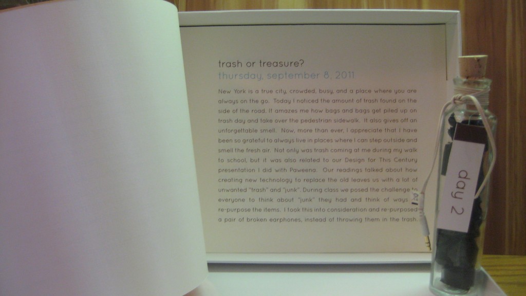
Throughout the discussion of a blogject and how a blogject tracks, traces, embeds history, reveals events, and allows for an exchange in ideas I could not help to think that this is no new technology or idea.  In Kindergarten, I remember learning about the Humpback Whales that migrate to Hawaii every winter to breed in warmer waters. This triggered my memory because we learned about how they track the same whales year to year by the prints on their tail fins. Another animal that is tracked is the green sea turtle. The Hawaii Wildlife Foundation uses this data to learn more about the turtle’s journey. Both of these examples are similar to how a the idea of a blogject was first introduced with the idea of a pigeon. These tracking devices tell histories of where these animals have been. In a certain way I think that my 7×7 project is a type of “blogject.”  The bottles itself contain items that track what I did that day, my experiences and reactions. It is a type of personal mapping that I will always have to look back to if I wanted to re-live this past week.
Grey Album Producer Danger Mouse Explains How He Did It
I heard the Grey Album before, but I did not know the back story of who did it and how.  This article is just one way to showcase how much time an artist or designer puts into a successful piece of work.  When someone is good at something, they make it look easy. The final product is seamless because they are highly qualified or worked hard to do their job. In this case, I never put a second thought into The Grey Album, and how difficult it was to produce.  Reading about how Danger Mouse had to deconstruct each song and break down the musical beats, I started to appreciate the album a lot more.  To know that he paid attention to every detail brings more value to the work.  The fact that it was controversial, but he continued makes it better.  With anything a person creates, they must do it because they want to, not because they are told to. “I just made sure it was something I would dig myself.” –Danger Mouse

7×7: Messages in a Bottle

Assignment: Complete one project a day for seven days.  This started off as a very challenging task, but as I started incorporate my new lifestyle and adjusting to New York into it, the process was much more natural.  Being far from home, a lot of people want to know what I am doing here.  Since Hawaii is surrounded by the Pacific Ocean, I decided work with the idea of sending home a “message in a bottle.” Everyday, I intended to try something new, make a new observation, or do something that I could visually contain in this bottle to send home and show others.  To see where I went and what I collected, view my 7×7 Presentation.

As I documented each day physically through collecting artifacts of my daily adventures, I also wrote.  These pages can be found in the back of the box containing all of the bottles. Here you can find my personal daily reflections.

After complete the project series, I learned a lot about myself. Sometimes I don’t actively focus on my feelings and reactions to experiences I have. The day moves by so quickly, and being busy allows me to forget that I everyday there is something to be learned. Read more about my thought process in my project write-up.

I enjoyed this exploration because I can look at back everyday of this past week and know exactly how I felt and what I did that day, just by the few visual momentos I collected in the bottles. I think this idea could be taken further digitally.  Maybe it is not reasonable to collect 365 bottles for everyday of the year, but through taking pictures and documenting thoughts, I could do the same thing and have an on-going online website. This would be a challenge I would like to see myself continue!


Snail Mail Kit: Connecting Friends, the Old-Fashioned Way!

Assignment: Re-Design a Social Network

Concept: Today, we are being introduced to new ways of connecting with friends using technologies and a majority of internet-based networks. Although this is great at keeping in touch, we are losing “touch” of what it was like to receive a hand-written, personal letter.  There is nothing more personal and sentimental than receiving a letter from someone and knowing that it traveled some type of distance to physically get to you.

Although my initial thought was to create a simplified bulletin board post social network, I slowly realized in my process that what I was creating was moving in a different direction from what I believed in.  This is where “Snail Mail” really started to develop. “Snail Mail” creates a social network the “old-fashioned” way.

How it Works: The key components of “Snail Mail” was to first send a letter to three friends. When you do this you also send two additional note cards and postage so that person has the opportunity to send their own mail to another friend.  This is where the “network” is created.  Whether the person decides to send mail back to you, or to two new friends, it opens up communication through letters.  It is a conversation starter, a trail maker, and a friend connector.

Here is my complete Snail Mail Presentation with pictures and my thought process.

Week 2.0 7×7

This project was a lot of fun for me. The way I tackled this problem was that I first thought of a theme. I need some sort of boundary, so I came up with the 7 deadly sins. But, I didn’t just want to do the 7 deadly sins, because it’s been done over and over. So I wanted to twist the concept a bit. When you think of a sin, like gluttony, the polar opposite of that sin could also be really bad in itself. Eating in moderation is fine, but eating so little to point of anorexia is probably not the healthiest way to eat. So, I guess the point of the whole concept is to show moderation. Take the middle path.

I thought about the opposite of the sins and called them “virtues,” and twisted them. All my projects share the same theme of “twisted virtues,” but each project has been executed differently.

ENVY CONFIDENCE

The first sin I thought about was “envy.” The opposite of “envy” would be something like “confidence.” Then I thought what if someone was over-confident, maybe to the point of vanity? That’s not really a good thing either. So I made a hat out of found objects in my apartment that would allow people to look at themselves the whole time they’re wearing the hat. I basically attached a mirror to a hat that you could reposition to better view yourself.

PRIDE SELF-ESTEEM

This sin was a little confusing but the twisted virtue was “low self-esteem.” Then I thought about the people whose self-esteem was so low, that perhaps they wanted to commit suicide, or had tried to commit suicide before. I chose to make a noose as a representation of suicide. A symbol. I then spray-painted the noose black and red to show the darkness and sadness around the idea of suicide.

WRATH HAPPINESS

“Wrath” is a sin, but happiness is a good thing. A state we all wish to achieve. But some people are so desperate to achieve this state of happiness that they take drugs like anti-depressants to reach this state. I’m not talking about people who really need to take anti-depressants, but I’m more speaking about those who take anti-depressants to deal with every day stress, or those who take them recreationally. For this part of the 7×7, I made a processing sketch. The sketch has an emoticon bouncing around, and when you feed the emoticon an anti-depressant (like Paxil), the emoticon becomes happy.

finding-happiness

GLUTTONY ABSTEMIOUSNESS

For “gluttony,” I thought about people who eat so little, that it’s unhealthy. For this part of the 7×7, I fasted for one day. I wanted to see what it felt like to deprive myself of something I loved so much. On the scale, I probably fall closer to being a glutton than an ascetic. I kept a video blog throughout the day talking about how I felt.

http://vimeo.com/28964455

GREED CHARITABLENESS

This execution falls off the realm of the concept. My original idea had been to donate to non-charitable causes. For example, only donate money to people who outright admitted that they only wanted the money to buy booze. Basically, donate money to non-charitable causes. However, I only encountered people who really seemed to need the money. So instead, I decided that I would donate $5 to each person who had a sign or a cup that indicated that they were asking for money, in exchange for their stories. I then built a website to document the project and their fascinating stories.

http://lovepaweena.com/namesbehindfaces/

LUST DISGUST

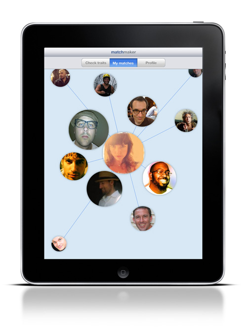
For this part, I thought about some of my friends who are so desperate to get married, yet are so picky. They have in their minds a set laundry list of every trait their potential  mate has to meet, and if their potential mate doesn’t meet their expectations, they act almost disgusted by these people. So, I designed a social networking iPad app for extremely picky individuals.

The user would be able select which traits they desire in their potential mate, or add their own.

The app would match these traits to a potential mate. The potential mate who most closely matches the user’s laundry list would be in a bigger circle closest to you.

The user can then view the potential mate’s profile. If the user doesn’t like the potential mate, they can just flick them off the screen, disgustedly, to make them go away forever. The person they picked will never again show up in their matches.

SLOTH INDUSTRY

The execution for this sin was purely for entertainment purposes only. I thought it would be a fun way to end such a dark presentation. However, it still goes with the theme. The opposite of a sloth would be a hard worker. When I presented this execution, I said, “Working hard is good, but not if you work so hard that you don’t sleep, and you don’t eat, or you might end up looking like this.” Then I showed my self-portrait that I created in Photoshop because I hadn’t been eating or sleeping in days. I was a representation of what I was trying to portray with industriousness.

Week 1.0 Redesign a “social network”

This project was very difficult for me. Right now as a designer, I’m struggling to do things that are “off-the-screen,” and I realize that I could’ve done something “off-the-screen,” but my thought process is to automatically think of screen-based designs. I thought and thought for so long how I can connect people without using the internet, so I thought about phones, snail mail, things we used to do before the internet was all up in your face.

Also, I need to set limitations for myself. I thought I wanted to create a way for locals to hook up with travelers. Based on personal experience, I would love to meet locals to show me all the cool spots, and just give me advice about the places I’m traveling to. My initial thought was that it’d be cool to place pseudo mailboxes all over the world where people could pick up and drop off real postcards to places they want to go. But what if the postcards never get picked up? Or they get picked up and the traveler has already come and gone? I couldn’t figure out the logic even though I tried and tried, so I ended up going screen-based again – much to my disappointment. But I shouldn’t create something non screen-based just for the sake of it. Sometimes it just makes more sense to design something on-screen, and use that tool because it is the best available tool for what you are trying to do.

So, I came up with a website, a very simple website, called “journeyers.com.” The website would be invite-only for the safety aspects of this site.

People would sign on, and then they could do one of two things – send a postcard or pick up a postcard.

How I imagine this site to function, is people would then select a postcard to send.

Then the person would write on the postcard. They can write whatever they want, just like real postcards. They can also write the activities in which they want to participate in when they visit these countries.

And then you would send your virtual postcard.

To pick up a postcard, the process would be very similar. The user would log-in, select “Get a postcard,” then choose a postcard of a person they’re interested in meeting. Perhaps the user would choose the person based on shared interests – they see that a traveler wants to go a place where they love to go. Or it could be based on appearances. Or the user can see that the traveler is from New York, and perhaps that local has lived in New York before, so they want to select that person. As a designer, I don’t know all the reasons why someone would choose one postcard over another. Because of that, the “Choose postcard” page would have all sorts of information available to the person who is selecting a postcard, or essentially, a person to hang out with.

After selecting a postcard, the user can then read the postcard and decide whether or not they want to contact that individual.

Also, the website’s simplicity in design is intended. I’ve seen many social networking sites where I’m not sure what to do. So by having only two functions, I feel as if it would be easier to navigate the site.