Final Project: Citta

“Citta” is a Buddhist word meaning heart and mind, with an emphasis on human emotion.

My family is originally from Thailand, where nearly 95% of the population is Buddhist. Naturally, this religion and Thai culture are tightly intertwined. I was born in Thailand but raised in the United States. And although I was raised in middle America, my parents were determined to raise me to be a “proper” Thai girl, following traditional Thai culture and values. Therefore, I embrace both cultures.One major aspect of Thai culture is the concept of “saving face,” because public image is especially important to Thai people. “Saving face” means going through great lengths to avoid confrontation so as not to embarrass yourself or other people, not bringing up negative topics in conversation, and not talking in an aggressive manner. With my upbringing, it has always been my understanding that this also meant not outwardly showing signs or expressions of negativity. Oftentimes, that means that I will laugh or smile when I’m in a state of discomfort.

However, on the other end of the spectrum, a popular Western idiom is “wearing your heart on your sleeve,” which means displaying one’s emotions freely and openly. It is believed that this phrase may have derived from Middle Ages jousting matches, where knights wore ribbons of the women they wanted to attract on their sleeves.

As a result, the concept for Citta stems from my complex relationship with being a part of two opposite cultures, making it a highly intimate piece. Citta is related to Thai culture because it allows wearers to outwardly express negative thoughts displayed on an LCD screen, while “saving face.” The final project is also related to Western culture because the thoughts are displayed for all to see. Thoughts are activated by soft buttons within a wearable glove.

Here is a video of my final prototype:

For more information, here is my final paper: MFADT-Final-Project-Paper-Paweena.

Happy holidays!

“Can you spare some change?” Group Write-up – Jen, Peter and Paweena

“Can you spare some change?” started out as a public spaces project. The goal was to create an interface in which strangers would interact.

Prototype I:

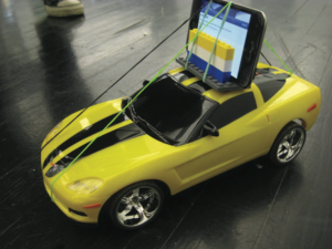
For our very first prototype, we took an RC car and attached an iPod to it so that we could use FaceTime to communicate between the iPod and our computers.

Here we are testing our prototype:

BumBot Prototype 1

It seemed pretty successful, so we moved forward.

Prototype II:

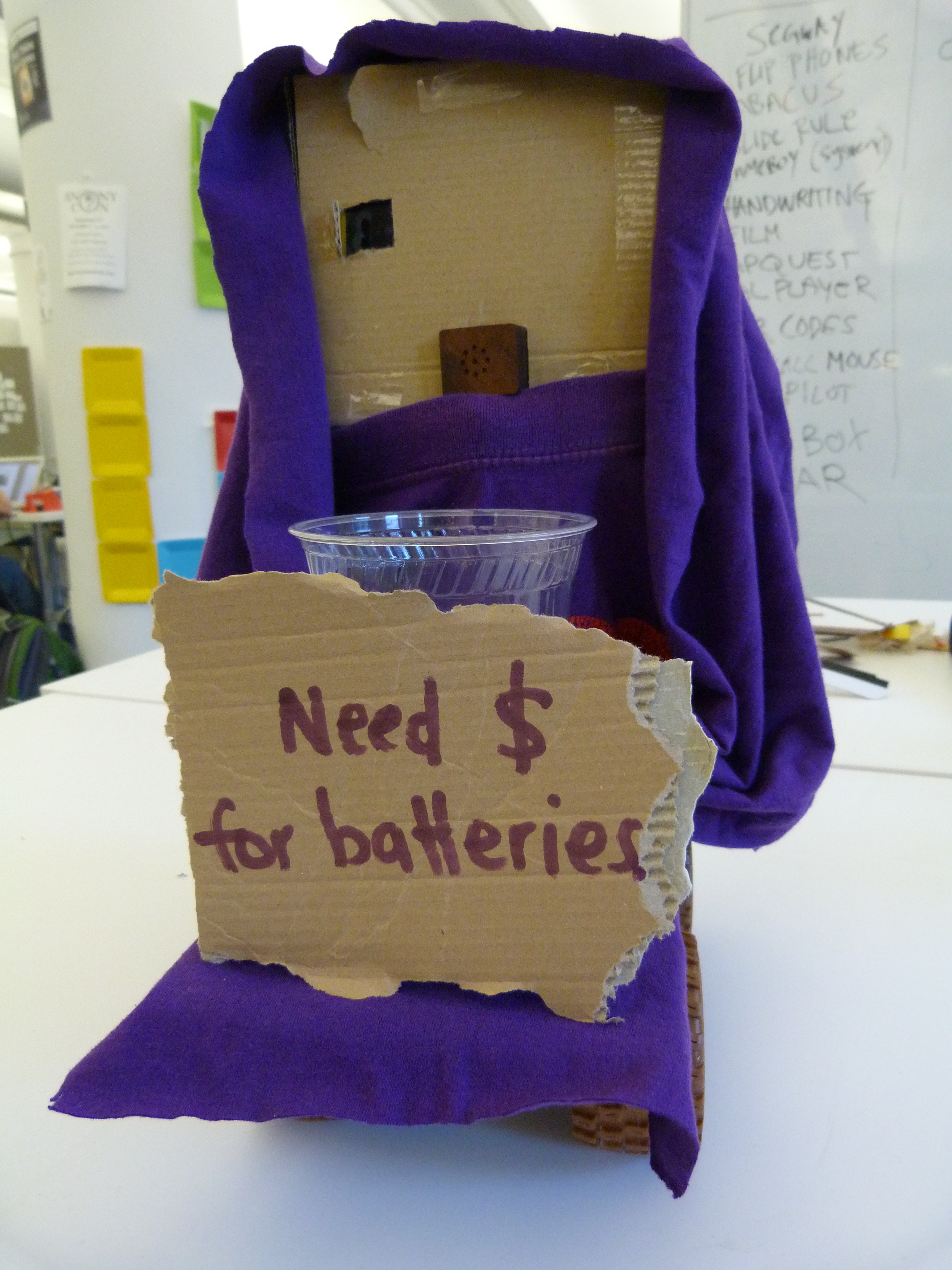
We then decided to give our prototype a personality. We were testing our prototype, and were approached by religious solicitors. So we started thinking about other solicitors, and thought about the homeless. Because I had worked briefly with a few homeless individuals in the city, and found them to be quite intriguing, we decided we would try to give our prototype a homeless personality. We then came up with this for our second prototype.

We put a mini portable speaker into the robot’s mouth, and asked my homeless friend, “Spooky” to help us test-drive it around Union Square in New York City. Here are the results from the first test.

Public Spaces Project Test 1 – Union Square

We felt that the results were overall successful. But, we were given some feedback from some of the strangers we encountered. A few people felt that this robot looked a little bit scary, and sloppy. And having one eye was creepy. So using that, and input from “Spooky,” we moved forward.

Prototype III:

Testing for the third prototype wasn’t as successful as we had hoped. According to more feedback, the black wasn’t as inviting as the cardboard. People also tended to gravitate towards the human aspect of the robot when it was wearing clothing.

So, we decided to go back to the original design, but make the robot more sturdy, and give him another eye. We also named the robot “BumBot” and gave him a Twitter account to enable people to follow his activities online.

Upon further research and thought, we decided that we wanted to compare how “BumBot” interacts with people, and how “Spooky” interacts with people. So we followed “Spooky” around for a few hours and made this video to document it.

A day with Spooky

We really enjoyed our day with “Spooky” and decided that for our final project, we would create a documentary.

Here is our final documentary.

\”Can you spare some change?\” Final documentary

“Can you spare some change?” is a short documentary that examines the relationships between human-human and human-“robot” interactions. A robot, “BumBot” was created by Parsons MFA Design and Technology students Peter Chang, Jennifer Matsumoto and Paweena Prachanronarong in collaboration with “Spooky,” a homeless citizen in New York City. “Spooky” drove “BumBot” around Union Square, and shared his perspective on the differences between human-human and human-robot relationships for one homeless citizen – himself. The documentary created a poignant examination into human relationships and the social landscape of New York City. The viewer is also asked if they can spare some change in their perception of the homeless community.

Music by: The Doors “People are Strange”

Week 4.0 reading response

The Social Life of Urban Spaces – William Whyte

Whyte is a master observer of spaces. He had very specific, in-depth observations, but I wonder if some of his observations are dated since more and more people tend to stick to their gadgets rather than choosing to partake in enjoying the open spaces that surround them. It should be noted that this book was written in 1980, and a lot has changed socially since then.

However, some observations still seem true today. For instance, Whyte noted that other people attract other people. I’ve definitely noticed this when it comes to restaurants or food trucks. If you see a restaurant of a food truck with people flooding out of their doors, people have a natural tendency to look inside the restaurant, or peek at the menu, to see why there are so many people there. It piques the passerby’s curiosity.

As Whyte cited his observations, it made me wonder what spaces my coworkers and I used to gravitate towards. I think as a group, we would gravitate towards spaces with people not necessarily because people were there, but because the presence of people indicated that it was okay for us to sit there; that we weren’t trespassing. Whereas in empty places we weren’t sure if it was okay for us to sit there. Another important factor was convenience. We looked for places to sit near wherever we bought our lunches.The open spaces usually had more people if there were a lot of restaurants nearby. You don’t want to buy lunch and walk 10 blocks to another location to enjoy your lunch.

Whyte’s observation about benches not being good places to sit also rang true. A bench can usually seat up to 4 or 5 people. If there is a single person, or a couple sharing a bench, usually strangers will not go and occupy the remaining seats on the bench. In turn, a lot of space is wasted with benches.

But Chapter 11: Triangulation is probably the most important chapter in regards to our public spaces project. Whyte says to make places friendlier. That’s probably a good idea. In San Francisco, there was a guy called The World Famous Bushman. He would hide behind his bush and scare innocent pedestrians as they were walking by. He would always get me to the point where I’d be afraid and paranoid about walking around Fisherman’s Wharf, which is where he would usually attack. So I think for this project, perhaps it’s a good idea not to scare people away.

Cultural Probes – Bill Gaver, Tony Dunne, &  Elena Pacenti

“Cultural Probes” was another article about very in-depth and thorough research and observation, except the methodology of research was very innovative and personal. I suppose it would be considered more “active” research. It seems as if it would be a successful way to gather information. While reading “The Social Life of Urban Spaces,” I did think to myself, why doesn’t Whyte just ask these people why they chose that specific space over other spaces. Researching in the way described in “Cultural Probes” does allow one to capture a more intimate side of an individual. It would be interesting for our public spaces project to involve ourselves in both this sort of “active” research and more “passive” observation, as described in Whyte’s book.

Experience Prototyping – Marion Buchenau and Jane Fulton Suri

What I hear, I forget. What I see, I remember. What I do, I understand. – Lao Tse

That quote from the essay rang completely true, in my own personal experience. “Experience Prototyping” explored another form of “active” research based on a user experiencing a product or design, rather than just seeing something beautiful. The designers put themselves in situations in which their clients may face, and tried to design based on those experiences, versus passive observation. I find the idea of experience prototyping to be common sense, however, designers need to figure out what sort of experiences are necessary to shape their designs. That, I believe, is the most challenging aspect of experience design.

Cardboard Computers – Pelle Ehn and Morton Kyng

This article explained the difference between mock-ups and prototypes. Basically, mock-ups are a less-finished, more rudimentary version of a prototype, made from cheaper materials. Because of their simplicity, mock-ups are helpful to designers. Users do not confuse mock-ups with the actual product, so users do not nitpick the product design. Instead, they focus on the usability and functionality of the product, which is the information the designers need to gather.

Week 3.0 reading response

Interaction Relabelling and Extreme Characters: Methods for Exploring Aesthetic Interactions – Gaver, Djajadiningrat, Frens

I agree that aesthetics and interaction should go hand-in-hand. I once took a training course at Cooper. Apparently Alan Cooper, who founded Cooper, is dubbed “The father of interaction design.” Their work model is that interaction designers and visual designers work together from start to finish. Cooper also has two interaction designers per team – an IxD: Generation who is responsible for the overall concept, and an IxD: Synthesis who is responsible for ensuring that the concepts are coherent and satisfies user needs and goals. Cooper is one of the leading interaction design firms in the country, so one may assume that that sort of work model is successful.

The concept of interaction relabeling is very interesting. It forces designers to think from different perspectives, which probably aids in increasing their creativity.

Once I got to the section about designing for extreme characters, I thought to myself, “is this a joke?” I was a little offended by the use of Snoop Dogg as the character for a drug dealer. These designers probably do not have any insight into the drug world, and they are basing their characters off generalizations and stereotypes and what they see in movies. With the Pope, I doubt they know the Pope. And with the polyandrous 20 year-old, it’s the same thing – assumptions, generalizations, stereotypes.

I thought all the solutions for the appointment manager were very weak, and it’s probably because the extreme characters whom the products were designed for are not realistic. The rings were obvious, and I doubt a drug dealer even needs rings to show importance. Sometimes the people who work for drug dealers never even see him or her, anyway. The Pope’s pen was a little bit more interesting, but these people would never know whether or not the Pope would use such a device. And I didn’t think the fan for the polyandrous 20 year-old wasn’t a good solution either. I think the solutions would have been more successful had they based their scenarios on characters that really exist in their lives or more realistic characters that aren’t fabricated by Hollywood.

Once I got to the “Evaluating the Concepts” and “Conclusions” section, I felt better that I wasn’t wasting my time reading nonsensical information since the designers openly admitted and recognized flaws in their design process.

Hertzian Tales – Anthony Dunne (excerpt)

This book, although dated, still had some valid points. I say this is dated, because I’ve noticed a lot of electronic products on the market that are focused on aesthetics now.

The first part of the reading was hard to get through, but once I got to the (In)Human Factors part, it started to pick up. I think overall what Dunne is saying is that as designers, we need to focus more on the aesthetic aspect of electronic products, and not make it so user-friendly and obvious. We should make the users do what we want them to do. Maybe even reshape the way they think a product ought to be, and how it ought to function.

Take the iPhone, for example. When the iPhone first came out in 2007, there were no phones or mobile phones that looked remotely like it. You look at an iPhone, and you see a rectangle. There are virtually no visual cues as to what a user is supposed to do once they pick up an iPhone. Where are the numbers? Where is the call button? The iPhone forced the user to follow its design model. The most revolutionary principle of the iPhone are the applications. It was a new concept to the market in terms of phones, yet it seems very successful if you think of how many people you see with iPhones or other similar smartphones.

I don’t completely agree with Dunne. Yes, aesthetics are important, but if people get so frustrated trying to figure out how to use the electronic object, they will just give up. I’m more of a believer in the “form follows function” principle myself.

The Design of Everyday Things – Donald A. Norman (excerpt)

When simple things need pictures, labels or instructions, the design has failed.

I first read this book many years ago around 2000. It was one of the first books I was assigned to read in my undergraduate program, yet it still resonates with me, and I often refer back to it. Norman writes this book beautifully, and his points, although also dated, are still valid.

Every time I encounter an object that doesn’t function properly, I think of Norman. For example, take the door to room 1205 in 6 E 16th Street. On the first day of class, I kept pulling the door, and nothing budged. After cursing the door, someone signaled for me to push the door. If someone has to signal you to push the door open, it obviously isn’t designed very well. The door has only a very subtle visual cue as to whether or not you are supposed to push or pull. I didn’t notice it until after I figured out that you’re supposed to push the door.

Also, the door directly to the left of the door to Room 1205 pulls outward. It is also identical.

After I got into the classroom, I thought about Donald Norman, and observed to see if other people had the same issues with this door. Everyone did. One person even knocked on the door, thinking the door was locked or something.

So, I’ll restate my position on this topic again. “Form follows function.”

Why We Need Things – Mihaly Csikszentmihalyi

I loved this chapter of the book and found myself completely agreeing with Csikszentmihalyi in every aspect. Csikszentmihalyi, when mentioning that objects compete with humans for scarce resources, made me think about how the majority of cars currently use gasoline. We’re going through our gasoline resources very quickly, so now designers are building vehicles that run off water. Water, which is also a depleting resource, is even more important and more necessary for the direct survival of the human species. People believe that the third World War will be over water, so I completely agree with Csikszentmihalyi in that aspect.

Objects of power, I find ridiculous. Do people really need to purchase expensive items just to prove their status? To me, it just proves that those people are idiots for paying so much money on a status symbol.

Sometimes objects can become major inconveniences, as well. Let’s say you buy a house because you want a house for whatever reason. Once you have a house, you become a slave to it. You always have to keep renovating it, and the worst part of owning a house is that you have a lack of freedom. It’s much more difficult to leave your house, which also doubles as a storage unit, and move to Europe, than it is to leave an apartment. And for what? It’s really just a box. And when you’re on your death bed, hopefully you’re not thinking about your house, or your BMW, but rather all the wonderful memories surrounding your life.

The Computer Revolution Hasn’t Happened Yet – Alan Kay

I strongly believe that anything is possible. I believe one day we will all be able to see inside each others’ minds and record and analyze dreams. So in my opinion, mind-amplifiers are definitely possible. And it sounds as if the technology is almost there, although it’s somewhat creepy. This technology can create very unexpected results, good or bad.

The most interesting part of this article was reading about all the historical and modern pioneers in the computer field, and the evolution of the field. A lot of them seemed to straddle the line between crazy and genius, which I think is what it takes to think up groundbreaking concepts and ideas. I would love to meet Ted Nelson.

What do Prototypes Prototype? – Houde and Hill

This article was very informative. The process presented for prototyping seems to be a very solid model to follow. From my darker days in corporate America, I learned just how important different types of prototypes are, and I agree completely with the model presented in this article.

From my experience, I learned that if the designer is trying to show functionality, it’s very important not to have the design be “too finished,” or else the people reviewing the prototype may focus too much on the design details, and not on the functionality, which will not be very productive for the designer. Or as mentioned in the digital movie example, the designer needs to stress what sort of prototype they are presenting.

The audience needs to be taken into consideration. Within a design environment, paper prototypes may be acceptable, but not within the larger organization. That’s mostly because people you don’t encounter on a daily basis within the larger organization may have no clue as to what your role is as a designer. For example, at my previous position as a web designer, me and another web designer would both have to prototype the electronic annual report each year. Within our department, it was perfectly acceptable to show Photoshop prototypes, but when we presented our ideas to the CEO of the 1,000-person company, our prototypes had to be close to finished. It was very annoying because we both spent a lot of time on this project, knowing one person’s work would not even be used. But because the CEO was not very familiar with the web, he needed to see how users could interact with the web site.

My favorite prototype example discussed in this article was the architect’s computer. Brilliant! The designers only needed to know if the pizza box was the right shape, weight and form. From the user carrying around that prototype, they were able to successfully gather all the information they needed to continue on with their artifact design.

Scrapyard Challenge Write-up

The Scrapyard Challenge was an overall fun and educational experience.

My team, consisting of Rachel, Juan and Firm, had an XBOX and a printer/scanner to work with. We had originally wanted to build a DJ turntable set, but it ended up being something entirely different.

The process

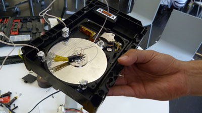
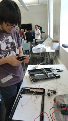
The first step in our process was that Rachel and Juan focused on taking the XBOX apart, while Firm and I took the printer/scanner apart.

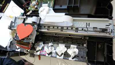
Then Rachel and I worked on figuring out the function of our product using the printer. We wanted the slider from the printer to sound like turntable scratching, but it became something entirely different. Now the function was that every time a user slid the printer bar across the printer, and pressed down a “key,” a note would play – almost like a sliding piano. We laid down the foundation for our product to work. We then configured all the wires and added some “decoration” to appease Rachel.

Meanwhile, Juan worked on the “beat” of the turntable.

And Firm worked on another slider using the scanner part of the printer/scanner.

Rachel and I tested our aspect of our group’s project.

Unfortunately, it did not work. The wires were configured properly, however, the wires were splayed causing the sensor points to be weakened.

We then rewired our product using different wires.

And it worked! Unfortunately, I didn’t get a video of our final product in action because the pizza came. But here is a video of our “jam session.”

Scrapyard Challenge jam session

As for Juan and Firm’s aspect of our product, Juan’s functioned properly but we didn’t have time to put our projects together, and Firm’s slider did not work. So in the end, instead of creating one coherent DJ set, it ended up being three different projects.

Final thoughts

Although our product didn’t turn out exactly as we had hoped, I had so much fun at the Scrapyard Challenge. I definitely learned a lot from this experience. When I first stepped foot in the building that Sunday morning, I had no idea what to expect. And I had no idea how to make some of the cool stuff other people had made in the past. I had no prior experience in this field at all. But by the end of the challenge, I gained a solid understanding of basic circuit principles. Now that I have that basic understanding, I’ve been thinking about other ways I can apply my newfound knowledge.

Week 3.0 Mashups

Media/software mashup: rememberwhen.com

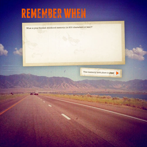
For this mashup, I wanted to see if it was possible to evoke a feeling of nostalgia that predates when most people had access to the internet. I mashed up Wikipedia, Billboard Top 20, Flickr and YouTube to create rememberwhen.com.

The site asks what the user’s fondest memory is, and in what year it took place.

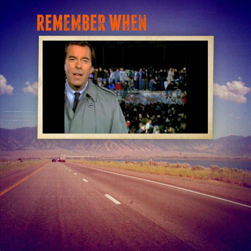
In this window you write your fondest memory. The website then aggregates all the data from Billboard Top 20 from 1989, Wikipedia, which has a cumulative database about individual years, and Flickr to try to recreate your memory. If not recreate, then at least act as a catalyst to bring memories from that time period to you.

The website then creates your personal memory video.

Memory video

You can then replay or share your memory video.

Hardware/internet mashup: Write to me

The concept of this mashup was to combine digital and analog so that every time the user receives an email from certain individuals, a robot hand would write out the email.

The user would receive a new email from a targeted individual, and once the user opens the email, the robot hand would start writing.

\”Write to me\” in action

The end product from one email would look something like this:

The robot would then continue to write emails repeatedly. The user would then have a record or collection of all their emails, like how gmail really keeps emails.

Week 3.0 Maker Faire (17 Sept 2011)

This was my second time going to Maker Faire, so naturally the brain starts to make comparisons between the first visit and the second visit. I was a little bit disappointed by the Maker Faire here this year because the vibe was incredibly different. It wasn’t as festive and fun. There were makers, but no faire. I was expecting to see more cool, crazy projects, but most things were pretty scaled-back, and commercial.

However, there were some very interesting projects.

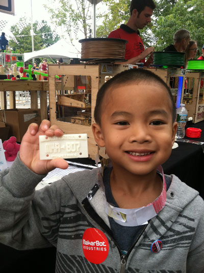
MakerBot Industries 3D Open Source Printer

For $1399, you can buy and build your very own 3D printer that takes an average person about 14 hours to build. It’s not a bad price considering the cost of other 3D printers in existence. When talking to the MakerBot representative, I found out that the printer takes 3D renders from programs like Google’s Sketchup, because they want to keep things as open source as possible. The plastics used to “print” are also relatively affordable. I’m all about saving money, so I think this 3D printer is a very good value, possibly investment.

The MakerBot rep hooked Ping up with a little license plate.

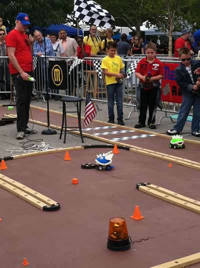
After seeing the printers, we went to check out the Shell Racers made using MakerBot Industries’ 3D printers.

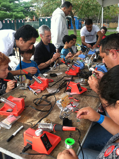
Also there were a lot of training sessions going on. I made an LED flashlight at the RadioShack booth, watched the ITP Processing training session, and watched people learn soldering skills. I spoke with one of the representatives from HTINK, who provide Arduino training classes for children and adults. I asked him if they have tutoring classes in Arduino in case I absolutely suck at it. And if you’re interested, he said we can work something out.

http://htink.org/main/

Oh, and this fire-breathing dragon was pretty cool.

Final thoughts

Overall, it seems as if the trend I noticed at Maker Faire is towards open source, which I think is great. It’s a nice little culture all with the goal of helping other people make things.

I was curious as to what my boyfriend (a copywriter in advertising), thought of Maker Faire, since he works with a lot of creative people, but not in the industry. He said, “The Maker Faire was a spirited exhibition of community, creativity, and a thriving subculture. From remote control robots to lifesize firebreathing dinosaurs, the festival is truly a healthy collection of collaboration and likeminded people. Regardless of one’s background, Maker Faire provides a sense of belonging to anyone who has an itch to scratch that can only be filled by making things the good, old-fashioned way: with two hands and an inquisitive mind.”


Week 2.0 7×7

This project was a lot of fun for me. The way I tackled this problem was that I first thought of a theme. I need some sort of boundary, so I came up with the 7 deadly sins. But, I didn’t just want to do the 7 deadly sins, because it’s been done over and over. So I wanted to twist the concept a bit. When you think of a sin, like gluttony, the polar opposite of that sin could also be really bad in itself. Eating in moderation is fine, but eating so little to point of anorexia is probably not the healthiest way to eat. So, I guess the point of the whole concept is to show moderation. Take the middle path.

I thought about the opposite of the sins and called them “virtues,” and twisted them. All my projects share the same theme of “twisted virtues,” but each project has been executed differently.

ENVY CONFIDENCE

The first sin I thought about was “envy.” The opposite of “envy” would be something like “confidence.” Then I thought what if someone was over-confident, maybe to the point of vanity? That’s not really a good thing either. So I made a hat out of found objects in my apartment that would allow people to look at themselves the whole time they’re wearing the hat. I basically attached a mirror to a hat that you could reposition to better view yourself.

PRIDE SELF-ESTEEM

This sin was a little confusing but the twisted virtue was “low self-esteem.” Then I thought about the people whose self-esteem was so low, that perhaps they wanted to commit suicide, or had tried to commit suicide before. I chose to make a noose as a representation of suicide. A symbol. I then spray-painted the noose black and red to show the darkness and sadness around the idea of suicide.

WRATH HAPPINESS

“Wrath” is a sin, but happiness is a good thing. A state we all wish to achieve. But some people are so desperate to achieve this state of happiness that they take drugs like anti-depressants to reach this state. I’m not talking about people who really need to take anti-depressants, but I’m more speaking about those who take anti-depressants to deal with every day stress, or those who take them recreationally. For this part of the 7×7, I made a processing sketch. The sketch has an emoticon bouncing around, and when you feed the emoticon an anti-depressant (like Paxil), the emoticon becomes happy.

finding-happiness

GLUTTONY ABSTEMIOUSNESS

For “gluttony,” I thought about people who eat so little, that it’s unhealthy. For this part of the 7×7, I fasted for one day. I wanted to see what it felt like to deprive myself of something I loved so much. On the scale, I probably fall closer to being a glutton than an ascetic. I kept a video blog throughout the day talking about how I felt.

http://vimeo.com/28964455

GREED CHARITABLENESS

This execution falls off the realm of the concept. My original idea had been to donate to non-charitable causes. For example, only donate money to people who outright admitted that they only wanted the money to buy booze. Basically, donate money to non-charitable causes. However, I only encountered people who really seemed to need the money. So instead, I decided that I would donate $5 to each person who had a sign or a cup that indicated that they were asking for money, in exchange for their stories. I then built a website to document the project and their fascinating stories.

http://lovepaweena.com/namesbehindfaces/

LUST DISGUST

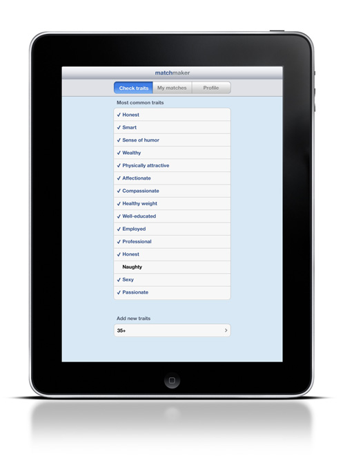
For this part, I thought about some of my friends who are so desperate to get married, yet are so picky. They have in their minds a set laundry list of every trait their potential  mate has to meet, and if their potential mate doesn’t meet their expectations, they act almost disgusted by these people. So, I designed a social networking iPad app for extremely picky individuals.

The user would be able select which traits they desire in their potential mate, or add their own.

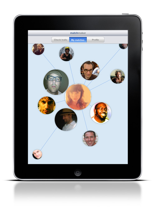
The app would match these traits to a potential mate. The potential mate who most closely matches the user’s laundry list would be in a bigger circle closest to you.

The user can then view the potential mate’s profile. If the user doesn’t like the potential mate, they can just flick them off the screen, disgustedly, to make them go away forever. The person they picked will never again show up in their matches.

SLOTH INDUSTRY

The execution for this sin was purely for entertainment purposes only. I thought it would be a fun way to end such a dark presentation. However, it still goes with the theme. The opposite of a sloth would be a hard worker. When I presented this execution, I said, “Working hard is good, but not if you work so hard that you don’t sleep, and you don’t eat, or you might end up looking like this.” Then I showed my self-portrait that I created in Photoshop because I hadn’t been eating or sleeping in days. I was a representation of what I was trying to portray with industriousness.

Week 1.0 Redesign a “social network”

This project was very difficult for me. Right now as a designer, I’m struggling to do things that are “off-the-screen,” and I realize that I could’ve done something “off-the-screen,” but my thought process is to automatically think of screen-based designs. I thought and thought for so long how I can connect people without using the internet, so I thought about phones, snail mail, things we used to do before the internet was all up in your face.

Also, I need to set limitations for myself. I thought I wanted to create a way for locals to hook up with travelers. Based on personal experience, I would love to meet locals to show me all the cool spots, and just give me advice about the places I’m traveling to. My initial thought was that it’d be cool to place pseudo mailboxes all over the world where people could pick up and drop off real postcards to places they want to go. But what if the postcards never get picked up? Or they get picked up and the traveler has already come and gone? I couldn’t figure out the logic even though I tried and tried, so I ended up going screen-based again – much to my disappointment. But I shouldn’t create something non screen-based just for the sake of it. Sometimes it just makes more sense to design something on-screen, and use that tool because it is the best available tool for what you are trying to do.

So, I came up with a website, a very simple website, called “journeyers.com.” The website would be invite-only for the safety aspects of this site.

People would sign on, and then they could do one of two things – send a postcard or pick up a postcard.

How I imagine this site to function, is people would then select a postcard to send.

Then the person would write on the postcard. They can write whatever they want, just like real postcards. They can also write the activities in which they want to participate in when they visit these countries.

And then you would send your virtual postcard.

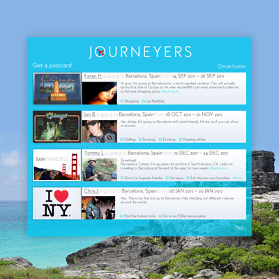
To pick up a postcard, the process would be very similar. The user would log-in, select “Get a postcard,” then choose a postcard of a person they’re interested in meeting. Perhaps the user would choose the person based on shared interests – they see that a traveler wants to go a place where they love to go. Or it could be based on appearances. Or the user can see that the traveler is from New York, and perhaps that local has lived in New York before, so they want to select that person. As a designer, I don’t know all the reasons why someone would choose one postcard over another. Because of that, the “Choose postcard” page would have all sorts of information available to the person who is selecting a postcard, or essentially, a person to hang out with.

After selecting a postcard, the user can then read the postcard and decide whether or not they want to contact that individual.

Also, the website’s simplicity in design is intended. I’ve seen many social networking sites where I’m not sure what to do. So by having only two functions, I feel as if it would be easier to navigate the site.

Week 2.0 reading response

Mashups: The New Breed of Web App – Duane Merrill

Prior to reading this article, I had only heard the term “mashup,” but I didn’t really know what it was. After reading this article, I still wasn’t 100% sure I knew what a mashup was. I understood it in terms of music, but I call them “remixes,” but I didn’t think I was familiar with them in terms of web apps. So I did a quick online search for “mashup web app examples,” and now I get it. Mashups are being used everywhere on the web, but I didn’t know they were called “mashups.”

I thought this was a very cool blog that tracks Google Maps websites, mashups and tools.

http://googlemapsmania.blogspot.com/

Also, this video was pretty helpful in clarifying what a “mashup” is.

Mashin\’ up with Granny Teller

This article, although 20% of it sounded like a foreign language, did however, give me an in-depth look into the back end of web apps.

Grey Album Producer Danger Mouse Explains How He Did it – Corey Moss

Naturally, the first thing I did after reading this article was listen to parts of the Grey Album. It’s remarkable. I found that I had a few songs from the Grey Album on my iTunes, but I hadn’t realized they were mashups because the way the songs were mixed blended in so seamlessly. And what’s more remarkable was his process. Burton took two “finished” pieces and deconstructed them, adding in bits and pieces here and there to create something completely new and extraordinary.

Calm Technologies 2.0: Visualising Social Data as an Experience – Michael Hohl, Ph.D.

I really enjoyed the essay about calm technologies. I’ve been stuck in the backwoods corporate world for the past four years as a fake web designer, and have been trying to push my thinking beyond the screen. So this essay really connected with me and what I am trying to do here at Parsons. The beautiful thing about our program is that we don’t always have to make something so functional and marketable. We can make things for ourselves. We can make things for our friends. We can make things for whomever we want. For example, Dimitrios Vlastaras’ “Web Visitors Blinker” was a purely personal project that gave him a “warm feeling.” The concept is so simple, yet quite interesting. And that’s really all you need.

I think it’s also important to note that I agree with Hohl. A lot of screen-based technologies are in your face. Surrounding you. Devouring your time. I like the idea of peripheral technologies. Accessible when you need them, when you want them, and there to give you those warm fuzzies during those moments you crave them.

What this essay did the most for me was that it inspired me. It really made me reflect upon this path I’m taking towards my future. This is grad school. This is probably the last time I will ever have all the time in the world to experiment and push my concepts beyond what I’ve been doing in the past. This is what you’re supposed to do in grad school, right? I feel like I’ll be successful here as long as I push myself, and distort my thinking and perception. Sometimes my experiments may not be successful in a marketable and pragmatic sense, but if it’s different and if it challenges me, then it will be successful to me. I know I have a long way to go since I automatically think of websites any time we’re assigned a project. I just need some time to get the corporate out of me and find my creative spirit again. In conclusion, this essay was really powerful to me personally, because it reminded me why I’m here.

Why Things Matter – Julian Bleecker, Ph.D.

Blogjects, as described in the essay, can be a very valuable research tool because they can go where no man can go. And they are definitely more cost-efficient than sending a person out to monitor a tree in the Amazon.

It’s also a very interesting concept to let the objects do the talking. With blogjects, we don’t have to guess. We can see with our own eyes what is happening to the planet. We can use the blogjects to see how our planet is changing, and we can analyze the data collected from the blogjects to help shape the future. Once we see what is happening to our planet, perhaps we will be more mindful as designers when creating new objects.

But blogjects don’t even have to go that deep. I’ve always wanted to have some sort of blogject for my son. I’ve wanted to give him a watch or necklace or something that he could wear everyday with a built-in GPS and camera. Then I could go on a website and see what it is that he does everyday. I know it sounds psychotic, but he’s been going to some sort of daycare ever since he was 6 months old. Before he could talk, I’ve always wondered what he did when I was at work. And after he started talking, his stories to me about his day are so terse.

Mama: What’d you do today?

Ping: I can’t remember.

Not acceptable! If only I had a blogject that would track the everyday activities of Ping…