This project was a lot of fun for me. The way I tackled this problem was that I first thought of a theme. I need some sort of boundary, so I came up with the 7 deadly sins. But, I didn’t just want to do the 7 deadly sins, because it’s been done over and over. So I wanted to twist the concept a bit. When you think of a sin, like gluttony, the polar opposite of that sin could also be really bad in itself. Eating in moderation is fine, but eating so little to point of anorexia is probably not the healthiest way to eat. So, I guess the point of the whole concept is to show moderation. Take the middle path.
I thought about the opposite of the sins and called them “virtues,” and twisted them. All my projects share the same theme of “twisted virtues,” but each project has been executed differently.
ENVY CONFIDENCE
The first sin I thought about was “envy.” The opposite of “envy” would be something like “confidence.” Then I thought what if someone was over-confident, maybe to the point of vanity? That’s not really a good thing either. So I made a hat out of found objects in my apartment that would allow people to look at themselves the whole time they’re wearing the hat. I basically attached a mirror to a hat that you could reposition to better view yourself.


PRIDE SELF-ESTEEM
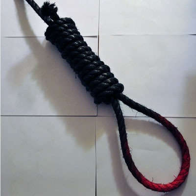
This sin was a little confusing but the twisted virtue was “low self-esteem.” Then I thought about the people whose self-esteem was so low, that perhaps they wanted to commit suicide, or had tried to commit suicide before. I chose to make a noose as a representation of suicide. A symbol. I then spray-painted the noose black and red to show the darkness and sadness around the idea of suicide.
WRATH HAPPINESS
“Wrath” is a sin, but happiness is a good thing. A state we all wish to achieve. But some people are so desperate to achieve this state of happiness that they take drugs like anti-depressants to reach this state. I’m not talking about people who really need to take anti-depressants, but I’m more speaking about those who take anti-depressants to deal with every day stress, or those who take them recreationally. For this part of the 7×7, I made a processing sketch. The sketch has an emoticon bouncing around, and when you feed the emoticon an anti-depressant (like Paxil), the emoticon becomes happy.
GLUTTONY ABSTEMIOUSNESS
For “gluttony,” I thought about people who eat so little, that it’s unhealthy. For this part of the 7×7, I fasted for one day. I wanted to see what it felt like to deprive myself of something I loved so much. On the scale, I probably fall closer to being a glutton than an ascetic. I kept a video blog throughout the day talking about how I felt.
GREED CHARITABLENESS
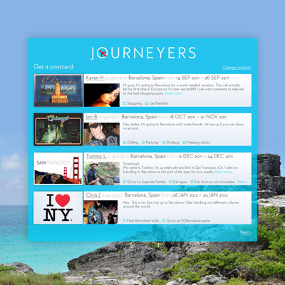
This execution falls off the realm of the concept. My original idea had been to donate to non-charitable causes. For example, only donate money to people who outright admitted that they only wanted the money to buy booze. Basically, donate money to non-charitable causes. However, I only encountered people who really seemed to need the money. So instead, I decided that I would donate $5 to each person who had a sign or a cup that indicated that they were asking for money, in exchange for their stories. I then built a website to document the project and their fascinating stories.

http://lovepaweena.com/namesbehindfaces/
LUST DISGUST
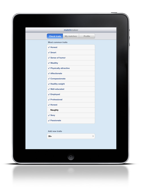
For this part, I thought about some of my friends who are so desperate to get married, yet are so picky. They have in their minds a set laundry list of every trait their potential mate has to meet, and if their potential mate doesn’t meet their expectations, they act almost disgusted by these people. So, I designed a social networking iPad app for extremely picky individuals.
The user would be able select which traits they desire in their potential mate, or add their own.
The app would match these traits to a potential mate. The potential mate who most closely matches the user’s laundry list would be in a bigger circle closest to you.
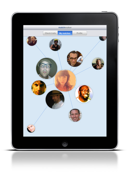
The user can then view the potential mate’s profile. If the user doesn’t like the potential mate, they can just flick them off the screen, disgustedly, to make them go away forever. The person they picked will never again show up in their matches.

SLOTH INDUSTRY
The execution for this sin was purely for entertainment purposes only. I thought it would be a fun way to end such a dark presentation. However, it still goes with the theme. The opposite of a sloth would be a hard worker. When I presented this execution, I said, “Working hard is good, but not if you work so hard that you don’t sleep, and you don’t eat, or you might end up looking like this.” Then I showed my self-portrait that I created in Photoshop because I hadn’t been eating or sleeping in days. I was a representation of what I was trying to portray with industriousness.